Travel! So fun, so educational, so humbling. Yet, so unaccessible.
Not everybody has the ability to travel.
Chances are, either you or someone you know has encountered hurdles in going on a vacation, attending events, exploring different countries, or even just stepping out of their own house. Financial constraints, physical limitations, and other restrictions often stand in the way. Travel can be expensive, stressful, and inaccessible.
How do we make Travel easier and more accessible?
If you can't physically travel or experience something, what's the next best thing?
In this project, I ventured into uncharted territory—virtual travel. An exploration at the intersection of a digital platform and virtual reality aimed at promoting tourism and enhancing its accessibility.
As a result, I conceived my digital brand, 360+, offering the opportunity to explore different landmarks and events through a VR experience. The application I'm developing is both educational and experiential—it provides information about any location of interest, allows users to virtually experience it, and aids in trip planning. This platform serves as a bridge for those unable to travel, enabling them to experience the beauty of various places without physically being present.
Innovative Approach: SYNTHESIS OF VIRTUAL REALITY AND A DIGITAL PLATFORM
Integrating a phone application with virtual travel.
WHY 360+?
Virtual Reality opens the door to a completely immersive experience, transporting users from the confines of the "real" world to an alternate reality with the freedom to interact and move through it using six degrees of freedom.
The name 360+ was chosen deliberately because it signifies more than a static image; it promises a truly immersive experience. This isn't just about looking around a 360-degree image but stepping into a space and actively engaging with it*. (*Keep in mind that a headset is needed to access the VR features of the digital platform.)
This project emerged through collaborative efforts, blending UX principles such as accessibility, adaptiveness, and inclusivity with the potential of virtual reality. The focus is not just on creating a visually appealing platform but one that seamlessly aligns with user behavior and expectations. The development process prioritizes efficiency, sustainability, and responsive design, aiming for a well-rounded and personalized user experience. The launch of this innovative concept is guided by ethical considerations, emphasizing transparency and ethical practices throughout the user journey. Ultimately, the aim is to provide a universally valuable experience that sets itself apart in the virtual reality landscape.
360+ stands as a digital brand centered on tourism, offering the chance to explore various landmarks and events through an immersive Virtual Reality experience.
THE APPLICATION
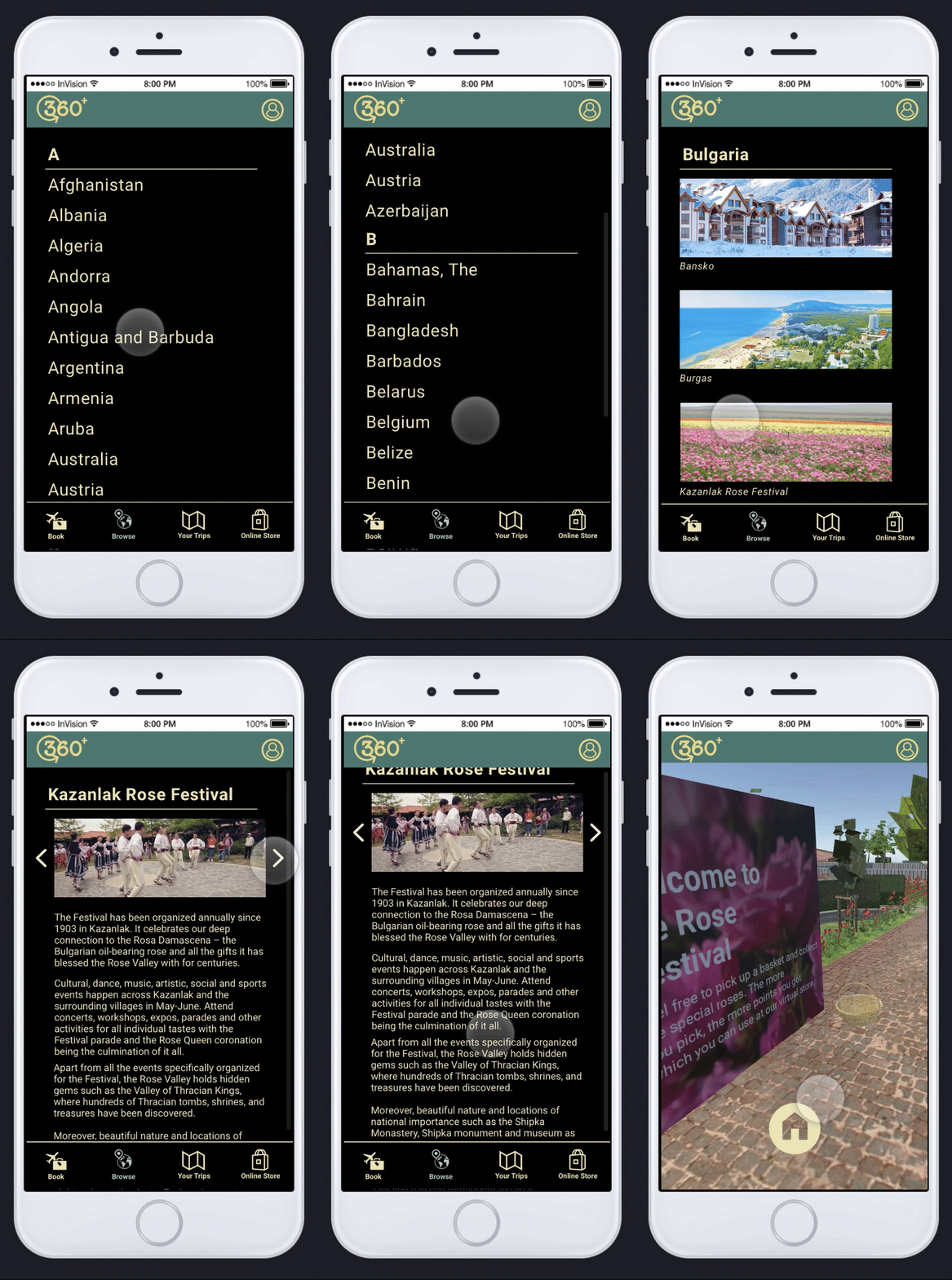
Within the application, users can effortlessly scroll through the available locations. Upon selecting a destination, the app provides detailed information about the location along with a visual showcase through a few images. The highlight of the experience lies in the VR tour, accessible through a headset. Not only is this feature available to headset owners but also strategically placed in locations with high foot traffic, such as malls. This deliberate move aims not only to extend the reach of the concept but also to offer those without personal technology an opportunity to partake in the virtual experience.
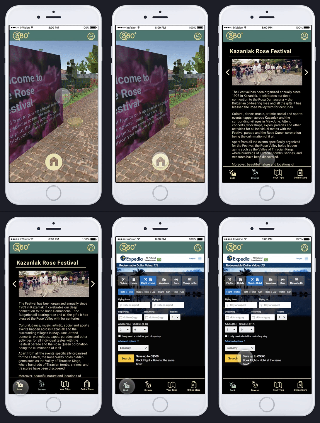
To further enhance user accessibility and provide valuable assistance, a booking option is integrated in collaboration with Expedia. This feature allows users interested in a particular location to seamlessly transition to a platform where they can plan and make reservations. The overarching goal is to actively promote tourism. The digital platform, aptly named 360+, distinguishes itself by offering more than just a traditional 360 image; it presents a virtual space that users can enter and interact with, necessitating the use of a headset for the full VR experience.
FEATURES
- Information on locations - Booking Options - Online Store - VR Pairing (available with headset) - Recording Experiences -
BROWSING BOOKING PREVIOUS TRIPS + ONLINE
ON BOARDING
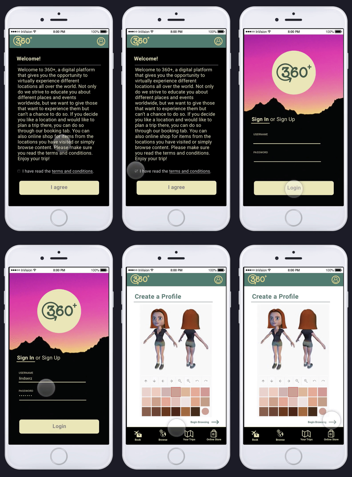
Throughout the onboarding process, users are invited to engage in a journey of self-expression by creating a profile and customizing their avatars. This intentional and user-centric design embraces UX principles of accessibility, adaptiveness, and inclusivity. The avatar customization is not merely a visual representation but an opportunity for users to infuse personality, creating a seamless and engaging experience.
The UI design ensures clarity, minimalism, and a clean aesthetic, avoiding distractions and fostering an effortless journey for users. As users explore the available travel destinations, the design prioritizes discoverability, offering an intuitive interface that aligns with users' behavior. For instance, in my use case, I'm selecting a significant event, the Bulgarian Rose Festival, to showcase the platform's cultural richness.
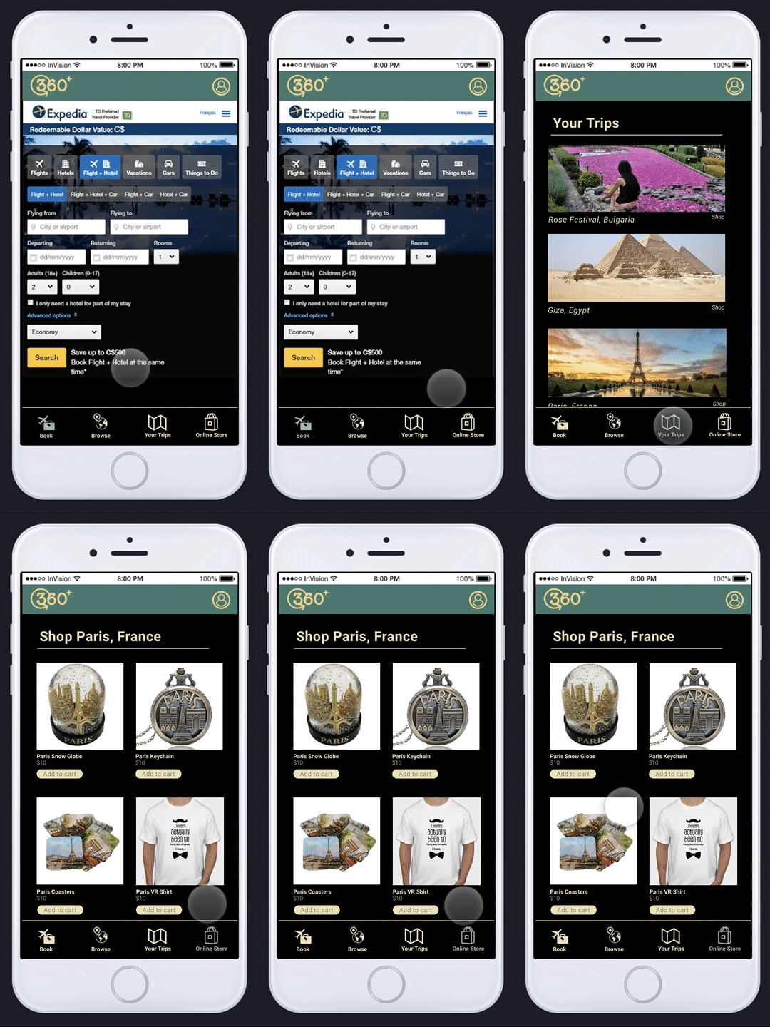
The integration of a booking option in collaboration with Expedia reflects a collaborative effort to address users' needs, providing them with useful information and transparent pathways to plan and reserve. To enhance the travel experience and further promote tourism, users can revisit their past virtual trips and purchase souvenirs from an online store. This immersive approach aims to humanize the digital experience, fostering empathy and emotional engagement.
Looking ahead, the store's evolution into the virtual space through virtual shopping signifies a commitment to innovative and sustainable solutions in UX and UI design. The platform maintains a harmonious balance between functionality, delightful motion elements, and a seamless user experience, aligning with the overall goal of disruptive and ethical launches in the virtual landscape.
Gamification
In crafting the user experience, I incorporated an engaging and intuitive game element into the 360+ platform. As users navigate through various tracks and explore landmarks, they are tasked with collecting purple roses, adding a purposeful and enjoyable dimension to their journey. This game is designed to encourage users to actively explore each experience, avoiding aimless wandering. Accumulating purple roses translates into earning points, which users can then redeem in the online gift store, enhancing the overall value and satisfaction of the virtual travel encounter. Each location introduces a distinct yet similarly straightforward task, imbuing the exploration with a mission-driven aspect. This thoughtful approach reflects the intentional design principles of UX and UI, ensuring accessibility, inclusivity, and seamless interaction while embracing diverse user behaviors and preferences. The game elements also leverage the principles of delightful motion, engaging experiences, and a harmonious interface, contributing to the overall success and sustainability of the platform.
VIDEOS OF PEOPLE INTERACTING WITH EXPERIENCE COMING SOON.
THE VIRTUAL EXPERIENce
In crafting the virtual space for 360+, I initiated the process with extensive research and a deep understanding of user behavior. Embracing the principles of UX and UI, I employed empathy to design a space that resonates with users' needs and preferences. Iterating through various prototypes, I leveraged collaborative feedback to ensure an intentional and user-centric design. The architecture of the virtual space is not only adaptive and inclusive but also addresses potential distractions, providing an effortless and engaging experience. Through an approach that values transparency and useful information, the design is cohesive and intuitive, minimizing overwhelm and making key elements perceptible.
In the realm of UI, I focused on creating an aesthetic that balances visual elements, ensuring clarity, cleanliness, and minimalism. Consistency in color, contrast, and typography is maintained to establish a distinctive and easily discoverable interface. The hierarchy of information is strategically organized, aligning with the principles of UX and enhancing the overall visibility. Delightful motion elements are seamlessly integrated, contributing to an emotionally engaging and harmonious user experience.
During the development phase, I prioritized efficiency, following established guidelines, and adopting a holistic approach for sustainable performance. The platform is responsive, leveraging motion and personalization to offer a unique and valuable experience. As we approach the launch, ethical considerations and a commitment to universal accessibility and uniqueness guide the platform's disruptive presence in the virtual landscape.
Transforming Cinema-4D Creations into VIrtual Environments using Unity
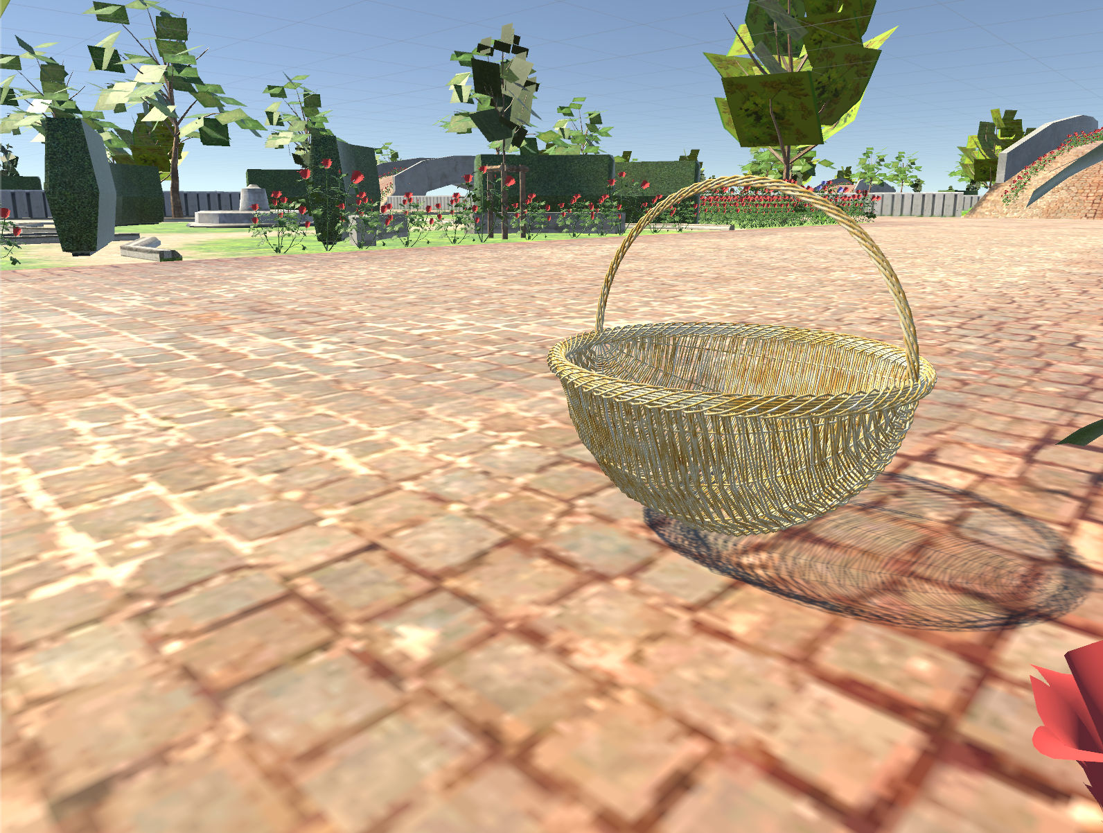
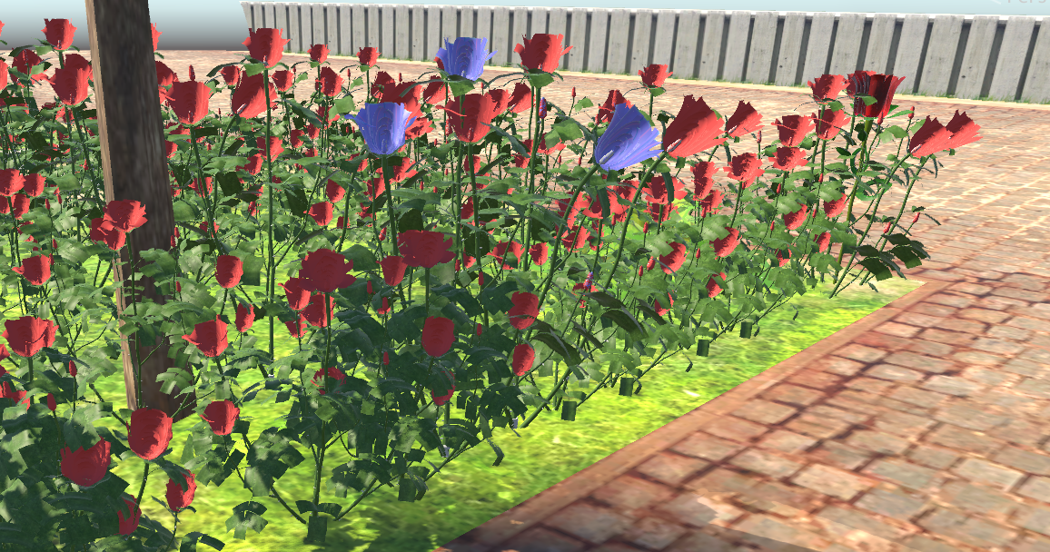
A rose I created using Cinema-4D
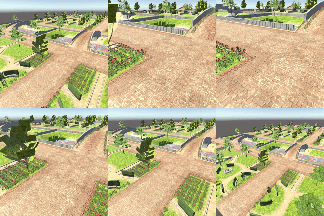
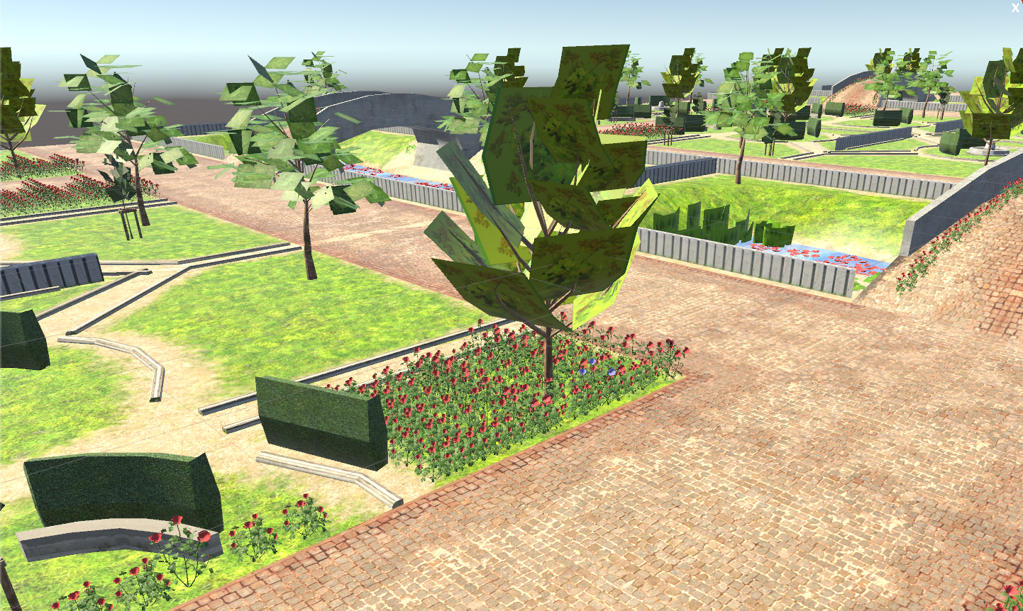
The VR space I created, representing the Bulgarian Rose Festival
WHERE CAN THIS EXPERIENCE LIVE?
Given that not everyone has ready access to VR headwear, 360+ aims to extend its presence beyond personal devices, ensuring a broader audience can partake in the experience. Locations with substantial foot traffic, such as malls and outdoor events like festivals or sports games, exemplify ideal settings for 360+. Imagine a 360+ tent strategically positioned in these areas, inviting people to immerse themselves in the virtual experience. Visitors would be prompted to download the application and connect it to the available headset, allowing them to enjoy the application on their phones even after the VR experience, offering a seamless and inclusive encounter for all. This approach aligns with the brand's ethos of accessibility, inclusivity, and the intentional embrace of diverse user behaviors and preferences.
DESIGN PRINCIPLES
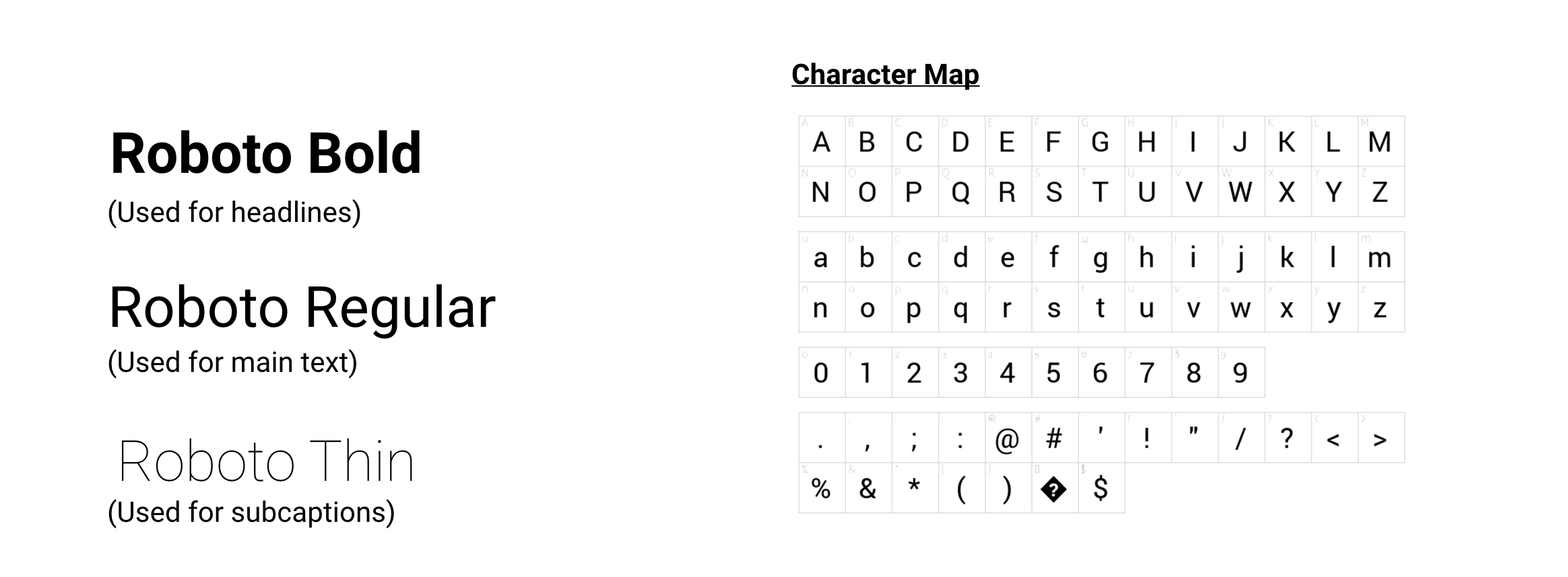
SECONDARY FONTS
MAIN FONTS
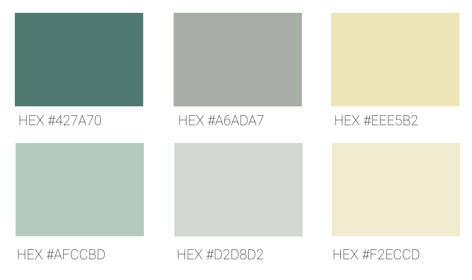
SECONDARY COLORS
The secondary colors function as subtler variations of the primary colors, serving for more substantial visual elements such as sidebars, fill colors, buttons, and specific text. The objective is to maintain a cohesive appearance; by aligning them with the same hue as the primary colors, I can guarantee a consistent look and feel for the brand across various components.
In specific scenarios, the logo might also integrate some of the secondary colors.
PRIMARY COLORS
360+ boasts the capability to transport users virtually to any corner of the globe. This is reflected in the brand's colors and overall tone, drawing inspiration from Earth, travel, and adventure. Green, a calming hue, is often linked with abundance, balance, calmness, growth, health, nature, and grounding. Yellow signifies adventure, new beginnings, and renewal. The objective is for users to forge a connection between the brand and adventure, instigating an innate attraction towards the multitude of new places, events, and experiences that the platform empowers them to explore.
The primary colors find application in icons, buttons, and smaller visual elements. The choice of color depends on the specific page it is intended for.
THE FUTURE
In envisioning the future possibilities for 360+, here are some potential scenarios:
Expanding Beyond Earth: Taking the virtual travel experience to new frontiers, possibly exploring other planets and offering users the chance to immerse themselves in extraterrestrial environments.
Anti-Gravity Sensation: Collaborating with indoor skydiving facilities to enhance the sensation of weightlessness, providing users with an even more immersive experience.
Social Travel: Facilitating group travel experiences, enabling users to explore virtual destinations with friends and attend events together, regardless of physical proximity.
Virtual Culinary Adventures: Introducing taste and smell elements through face electrodes in VR, allowing users to virtually taste and chew dishes from different nations. This could potentially impact the cooking industry and create new culinary experiences.
Virtual Shopping Partnerships: Collaborating with stores for virtual shopping experiences, using augmented reality to walk through virtual stores, try on clothes, and access additional product information by scanning QR codes.
360+ Cafe: Launching a dedicated Virtual Travel cafe, providing a space where users can gather and share their virtual travel experiences. This concept aligns with the overarching themes of accessibility, inclusivity, and the value of shared experiences.
FEEDBACK
RICK PLAUTZ, Adjunct professor at VCU Brandcenter, 3D generalist, motion designer
“I like the idea of being able to travel places that people wouldn't be able to go to easily. I can see this also being more or a guided tour where the user doesn't have to worry about controlling anything. I've seen a similar idea like this used in nursing homes to let seniors travel around the world or to see their home towns.
Conceptually, it could be cool to use images of the moon or Mars and pitch it as a vacation spot - just for fun. There are plenty of 360 images of the moon or Mars - but what about some kind of galactic gift shop? Could be cool to include all the same tourist-y tropes of places on Earth but stretch it to places that are either a fantasy or not realistic.
I like the VR-only gift shop too. What about just having a selection of actual gifts you could buy at the Bulgarian Rose Festival that you could buy online after seeing it? I don't think you'd need to expressly say "I didn't actually go but here's this..." I think part of the conceit of VR is that, if it works really well, you don't feel like you watched something or put a headset on. The memory you walk away with is that you were actually there. So why not also get a souvenir?”
TAKEAWAYS
Consider a guided tour for the future
Play around with different planets
TEAM
Linda Kirova (XD)


